Flexbox
| 📚 Table of Contents |
|---|
| Optional Setup |
| Flex Container |
| Flex Direction |
| Justify Content |
| Align Items |
| Align Self |
| Order |
| Flex Items |
| Gaps |
| Inline Flex |
| Flex Wrap |
-
like with most of this course, you can skim this section for a nice overview and/or use it as reference but if flexbox is brand new to you or if you don't have a firm grasp on it, I definitely recommend following along and setting up a flexbox playground. I'll show some visual examples but nothing will help this stuff sink in like changing the values yourself to see how they affect the elements on the screen.
-
when you're done going through this, check out flexbox froggy (opens in a new tab) 🐸 for some fun pracice
optional setup
- if you're going to follow along, whip up a folder and two files,
index.htmlandstyles.css
$ # make a folder
$ mkdir flexbox
$ # change into new folder
$ cd flexbox
$ # create both files with one command
$ touch index.html styles.css
$ # open the folder
$ . open-
open VS Code and drag both files in
-
pro tip: instead of dragging the HTML file into a browser and refreshing it every time you make a change to a file, you can make life a little easier on yourself and install Live Server (opens in a new tab). That is a VS Code plugin that will launch a server for your project. Install it, then just click "Go Live" at the bottom of your VS Code and then go to
http://localhost:5500/in your browser (it might open automatically) to find your site. it will refresh automatically every time you make a change and save a file in VS Code -
ok lets bootstrap our HTML file for this project:
<!DOCTYPE html>
<html lang="en">
  <head>
    <meta charset="UTF-8" />
    <title>Flexbox</title>

    <link rel="stylesheet" href="styles.css" />
  </head>
  <body>
    <h1>Flexbox</h1>

    <div class="circle cyan"></div>
    <div class="circle magenta"></div>
    <div class="circle yellow"></div>
  </body>
</html>- now the CSS file:
body {
  background-color: #1e2429;
}

h1 {
  font-family: "Helvetica", sans-serif;
  color: #cbcbcb;
}

.circle {
  width: 75px;
  height: 75px;
  border-radius: 50%;
  margin: 10px;
}

.cyan {
  background-color: #00ffff;
}
.magenta {
  background-color: #ff00ff;
}
.yellow {
  background-color: #ffff00;
}- break that all down: I created three empty divs to make colored circles out of (to have some things to move around the screen), gave them all a
circleclass and a class for their own color. then in the CSS file, I added a background color to the entire page and changed the color and font of the heading to make everything a little easier on the eyes. then made the empty divs into circles and gave them their colors. this is what it looks like:
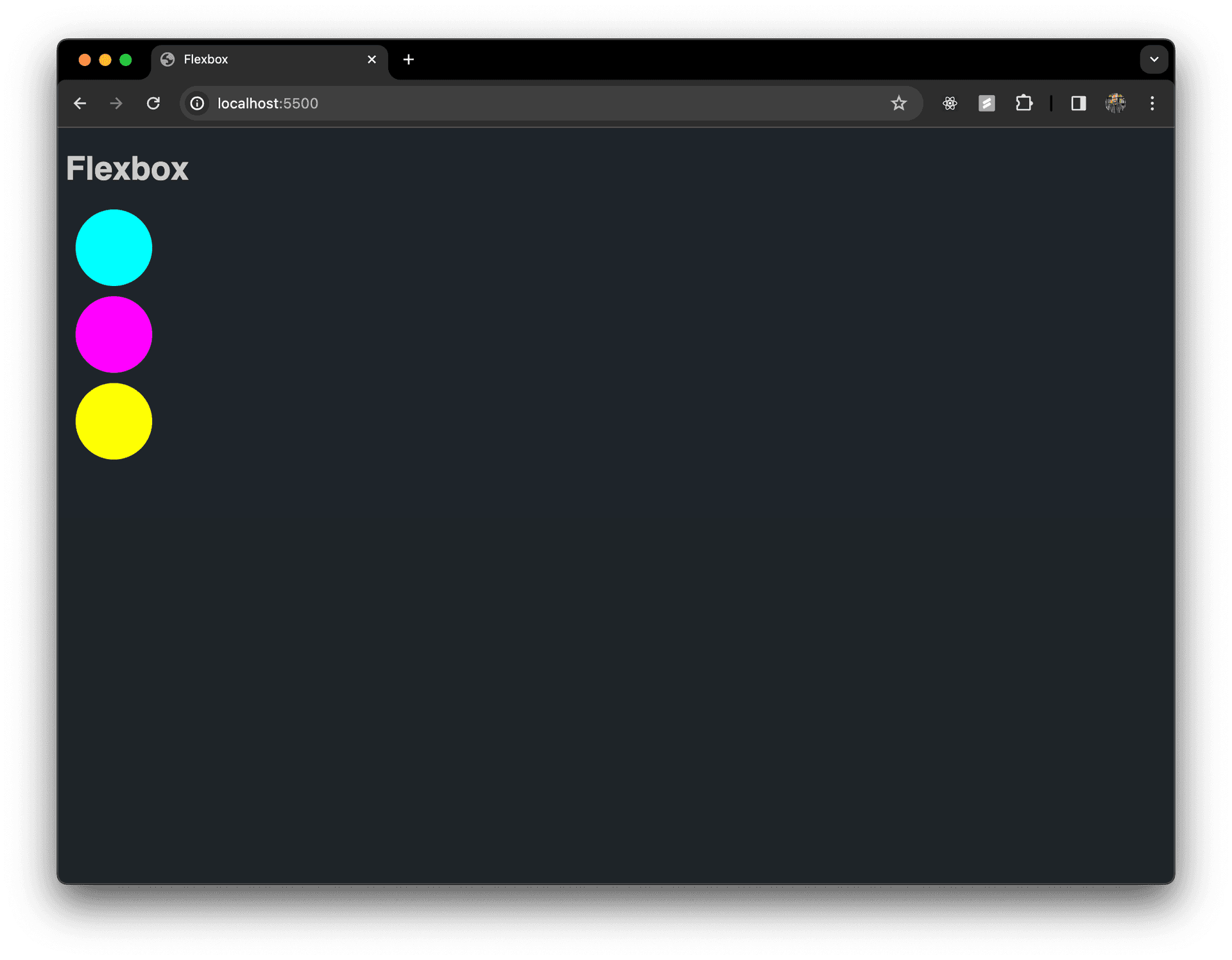
- so, above we have all the elements on the screen displaying in their default
normal flow. theh1anddivelements are all default block level, meaning they get their own line
Flex Container
- the first thing we need to do to start using
flexboxis put our HTML elements inside of a "flex container" - "flex container" meaning put all of the elements inside of a div. this is often called a parent element, which would make the ones inside children
- give that container a class so we can grab it in our CSS file
<!DOCTYPE html>
<html lang="en">
  <head>
    <meta charset="UTF-8" />
    <title>Flexbox</title>

    <link rel="stylesheet" href="styles.css" />
  </head>
  <body>
    <h1>Flexbox</h1>

    <div class="flex-container">
      <div class="circle cyan"></div>
      <div class="circle magenta"></div>
      <div class="circle yellow"></div>
    </div>
  </body>
</html>- then grab that class in our CSS file and change the
displaymode toflex
.flex-container {
  display: flex;
}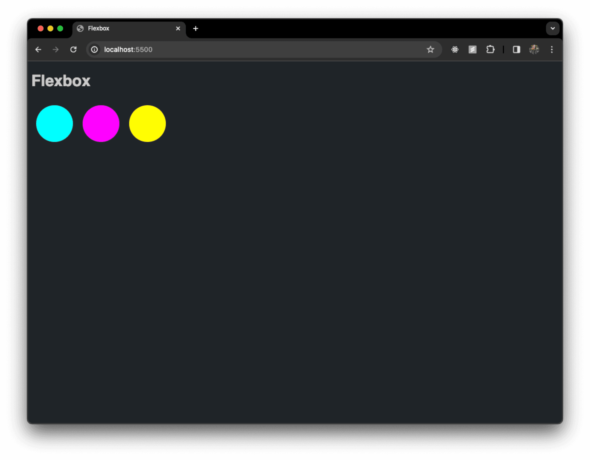
- cool, we technically have a "flexbox" now
flex-direction
- so flexbox is all about arranging your elements in rows or columns so that is one of the first things you define once you have that parent container set up
- the first propety you can use on a flex container is
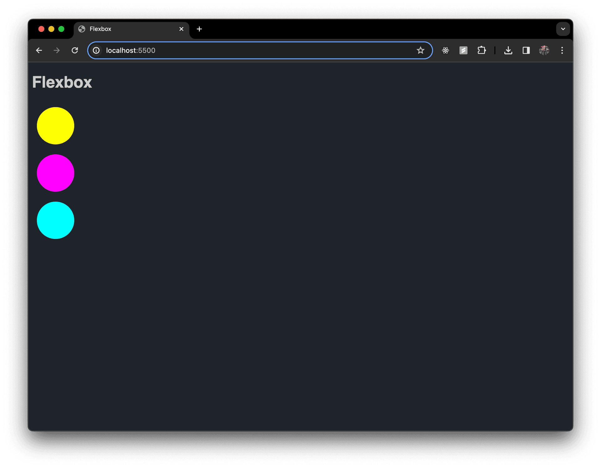
flex-direction, and you have four options:column: which will arrange your child elements in a column (this one won't look much different from our "normal flow" at first). it stacks the elements vertically from top to bottomrow: the default for flex. row will arrange the elements horizontally from left to rightrow-reverse: arranges the elements from right to leftcolumn-reverse: stacks elements in a column but orders them from bottom to top... so reversed
- try them and see what happens:
.flex-container {
  display: flex;
  flex-direction: column-reverse;
}
- by defining the
flex-direction, you are defining the primary axis of the elements, horizontal or vertical
justify-content
- with the primary axis defined, you can then arrange where the elements are distributed along the axis with
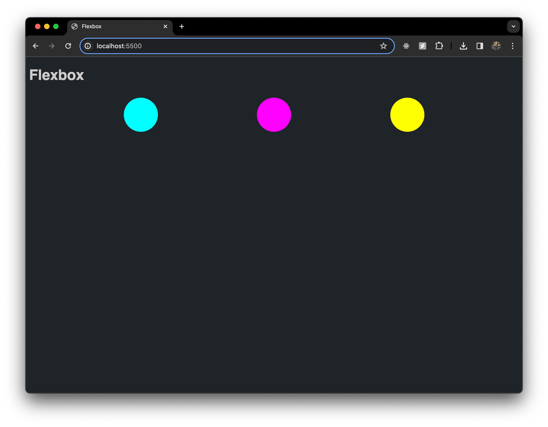
justify-contentpropertycenter: sometimes this one is all you need. this bunches your items in the center of the primary axisflex-start: bunches items at the start of the primary axisflex-end: bunches items at the end of the primary axisspace-between: spreads items apart with even space between elements but the first element is flush with the start and last is flush with the endspace-around: spreads items apart with space between elements with the start and end gaps being half the size of the space between each itemspace-evenly: this spreads items apart with start, in-between and end gaps all being equal
- mess around with these too:
.flex-container {
  display: flex;
  flex-direction: row;
  justify-content: space-evenly;
}
align-items
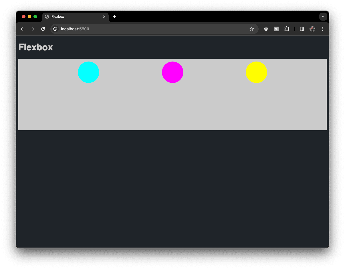
- now, we can start aligning our items along the cross axis
- I'm going to give our parent container a background color and some height so you can see whats really happening here
.flex-container {
  background-color: #cbcbcb;
  height: 250px;
  display: flex;
  flex-direction: row;
  justify-content: space-evenly;
}
- to arrange your elements along the cross axis, use the
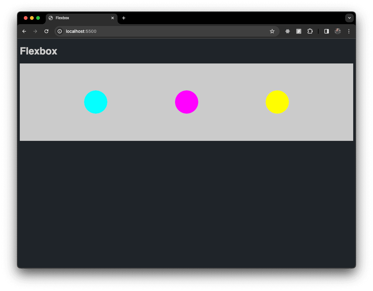
align-itemspropertyflex-start: this is the start of the cross axis which is the default, see pic aboveflex-end: you guessed it, this puts the elements at the end of the cross axiscenter: centers the elements on the cross axis. if you don't use this, and only use justify-content: center, then your items won't actually be centeredstretch: stretches the flex items to fill the container (this is default)baseline: aligns the flex items so their their baselines align, this is hard to show with elements that are the same size. basically, if your elements are different sizes, it will line up the items along the middle or baseline of the element
.flex-container {
  background-color: #cbcbcb;
  height: 250px;
  display: flex;
  flex-direction: row;
  justify-content: space-evenly;
  align-items: center;
}
align-self
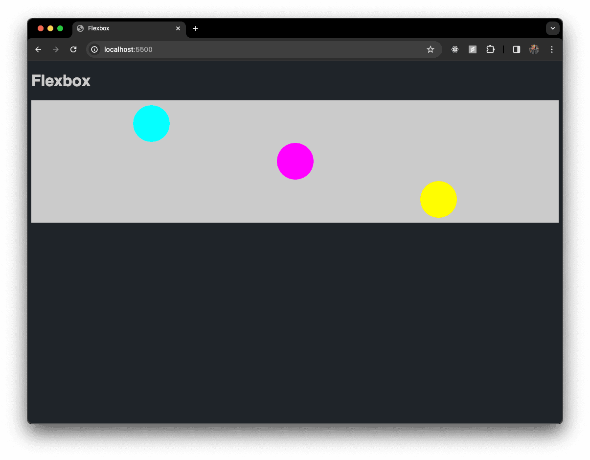
align-selfis cool because you can override the align-items value from the parent container for specific child elements. you do this by targeting the specific items you want to override- you have the same values available as
align-itemsand they work the same way
.cyan {
  background-color: #00ffff;
  align-self: flex-start;
}
.magenta {
  background-color: #ff00ff;
}
.yellow {
  background-color: #ffff00;
  align-self: flex-end;
}

.flex-container {
  background-color: #cbcbcb;
  height: 250px;
  display: flex;
  flex-direction: row;
  justify-content: space-evenly;
  align-items: center;
}
order
- honestly, I view this one as sort of a quick hack and don't really use it a lot
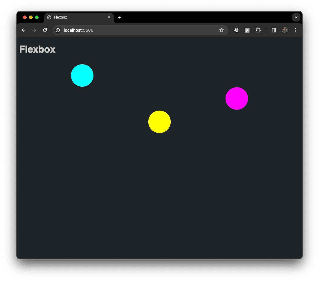
- instead of rearranging the HTML elements, you can change or explicitly define the order of a child element with the
orderproperty
.cyan {
  background-color: #00ffff;
  align-self: flex-start;
}
.magenta {
  background-color: #ff00ff;
  order: 3;
}
.yellow {
  background-color: #ffff00;
  align-self: flex-end;
}

.flex-container {
  /* background-color: #cbcbcb; */
  height: 250px;
  display: flex;
  flex-direction: row;
  justify-content: space-evenly;
  align-items: center;
}
Flex Items
- there are three more properties to help you really dial in and fine tune the specific elements inside of a flexbox
flex-basis
- not gonna lie, this one can be a little confusing and I didn't totally grasp this for a long time
- basically,
flex-basiswill set the width of an element in a row or will set the height in a column - it sets the initial size of an item before the remaining space is distributed
flex-basisis more of a suggested size, if there isn't enough space for all of the elements to fit at their assigned size, they find a compromise in order to avoid an overflow
flex-grow
- by default, items in a flexbox will shrink down to fit their minimum size as needed. sometimes this creates extra space in the row or column and
flex-growis how you can tell a specific item to take up more space if its available - like flexbox itself, you need to opt-in for
flex-grow.flex-growis set to 0 by default - if all items have
flex-growset to 1, the remaining space in the container will be distributed equally to all children, if one of the children has a value of 2, that child would take up twice as much of the space. you can keep going to fine tune how the elements grow (you can't use negative numbers). these values are ratios
flex-shrink
- as you would expect,
flex-shrinkis the opposite offlex-grow - again, its all about setting the ratios of space between elements to properly size the elements themselves
- unlike
flex-growthough,flex-shrinkhas a default value of 1 so you have to manually set it to 0 to prevent shrinking - this is sort of an alternative to using the
min-widthproperty. instead of defining a minimum width that an element can't shrink passed, you are controlling it a different way
flex items TLDR;
flex-growcontrols how the extra space is distributed when the items are smaller than their containerflex-shrinkcontrols how space is removed when the items are bigger than their container
gaps
- controlling the
gapsor space between child elements is another way to really dial in your design - fine tuning the
gapsis actually pretty new to flexbox and only really heavily supported on most browsers sine 2021 gapworks pretty much as you would expect, the only thing you realy have to know is that the propertygapsort of defaults torow-gapso if you want to explicitly define a size for space between column elements, you'd need to usecolumn-gap
inline-flex
- one of the last things I want to mention is
inline-flex - we already know about normal flow and inline and block elements and how a flex container can take control of the children elements
- the flex container itself is a block level element by default. if maybe you want two flex containers next to each other on the same row, you can make them
inline-flex - simply define your
inline-flexcontainer like this:
.flex-container {
  background-color: #cbcbcb;
  height: 250px;
  display: inline-flex;
  flex-direction: row;
  justify-content: space-evenly;
  align-items: center;
}
flex-wrap
-
lets wrap up this section on flexbox 🥴
-
basically if your elements do not fit on one row or column,
flex-wraplets your elements wrap onto the next row or column -
this is huge for responsive design
-
you have to opt-in for
flex-wrapand when it is on the child elements won't shrink passed their hypothetical size, instead they will start a new row or column -
this is the default for
flex-wrap:
.flex-container {
  display: flex;
  flex-wrap: nowrap;
}- turn it on like this:
.flex-container {
  display: flex;
  flex-wrap: wrap;
}- if you want to get wild you can also reverse the wrap like this:
.flex-container {
  display: flex;
  flex-wrap: wrap-reverse;
}